


Responsive CSS frameworks and boilerplates are more widely utilized these days due to the fact that they are time savers and easy to use. With the help of these CSS framework and boilerplates it is easy to maintain one website for all devices. So, we compiled 10 best CSS Frameworks that will help you to create a responsive website and excellent for quick development. All of these have been developed maintaining the strict compliance to standards and conventions of CSS in mind. So test them out and choose the ones you like!
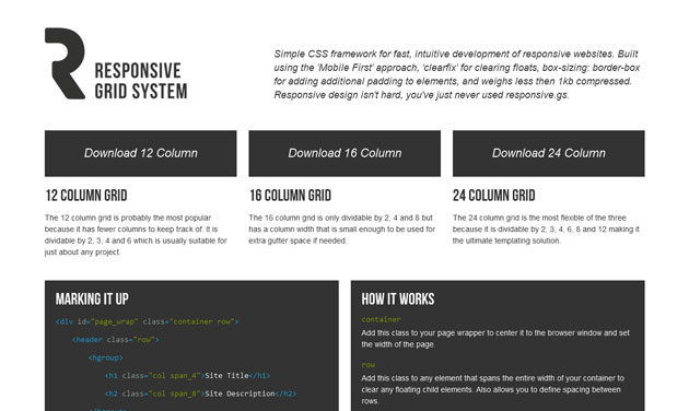
Responsive Grid System
Responsive Grid System is a Fluid grid CSS framework for rapid, user-friendly development of responsive websites. It’s available in 12, 16 and 24 columns with media queries that support all common devices, clearfix, and optional reset.
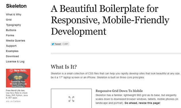
Skeleton
Skeleton is another Beautiful Boilerplate and Mobile-Friendly Framework to develop a Responsive Website.
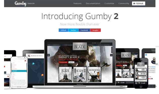
Gumby
Gumby Framework was designed to be the most flexible grid framework you’ve ever used. Gumby offers a choice of often downloading the different versions such as 12 columns, 16 columns, hybrid 12/16 columns or definitely all in a single package.
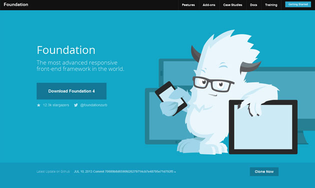
Foundation 4
Foundation 4 framework is the most innovative responsive front-end framework. With the help of this framework you can rapidly prototype and develop sites or apps that work on any kind of device.
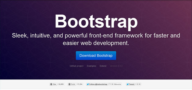
Bootstrap
Bootstrap is developed by Twitter and available on a 12 column responsive grid. It has integrated with fluid-width and fixed-width layouts and comes with optional JavaScript plug-ins support such as a Toggle tabs, Typeahead, image carousel, and many more.
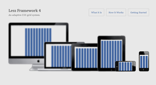
Less+ Framework
This is a cross-device CSS framework using media queries. Less+ encourages designers and developers to develop websites that can adjust their content based on screen resolution.
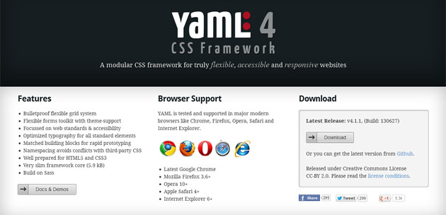
YAML
YAML is another free responsive framework that comes on 7th place in this list. If you want to develop neat design the YAML framework is just right for you! It packed with optimized typography for all standard elements, flexible grid system, and nicely ready for HTML5 and CSS3.
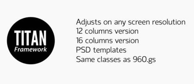
Titan Framework
It is another CSS framework for responsive website. This framework makes use of the same CSS classes as 960.gs, so transferring between the two is definitely easy.
Ingrid
Ingrid is a compact and fluid CSS framework, whose primary objective is to decrease the use of classes on individual models.
inuit.css
Inuit.css is a fantastic CSS framework that is actually designed with extensibility in thoughts. Use the customized grid builder to make your own responsive grid, and then download some igloos (plugins) to boost the structure in useful methods.


Great Post, very good info